
You might not think much goes into color usage in branding. Maybe you think to go with your favorite colors to see your personal style represented, or maybe your designer just arbitrarily chooses some without thought.
The power of color, much like the power of love, is a curious thing.
Personally, when I’m beginning a new branding project there are two important questions I ask myself: What is the style of the brand, and what colors speak that message?
I know… “How do colors ‘speak’ a brand? That sounds wild.” – but it’s true.
Think of it like this, if your brand is a traditional, corporate, and straight-laced it’s not likely you’d want to go with hot pink and neon yellow combination. If you’re a new and crazy brand directed to a younger audience, I don’t know that you’d choose hunter green and brown. On the flip side, maybe those out of the norm choices are exactly what you’d do as a way to stand out and position your brand as the one that is totally different from everything else in your field. That’s the power of color – it can completely set the tone for who your company is.
Color is an important psychological tool as well. Have you ever noticed that a lot of fast food branding is red and/or yellow? This is because not only are those colors bold and exciting in a way that is going to catch your attention driving down the highway on a long road trip when you’re starving for a quick bite, but because there is psychology involved there. Red invokes a feeling of intensity and even appetite, while yellow conveys happiness and optimism. As another example, take notice of the colors you see in tech or medical fields – a lot of blue, right? This is because blue evokes a calming sense of trust, and when it comes to something important trust is key.
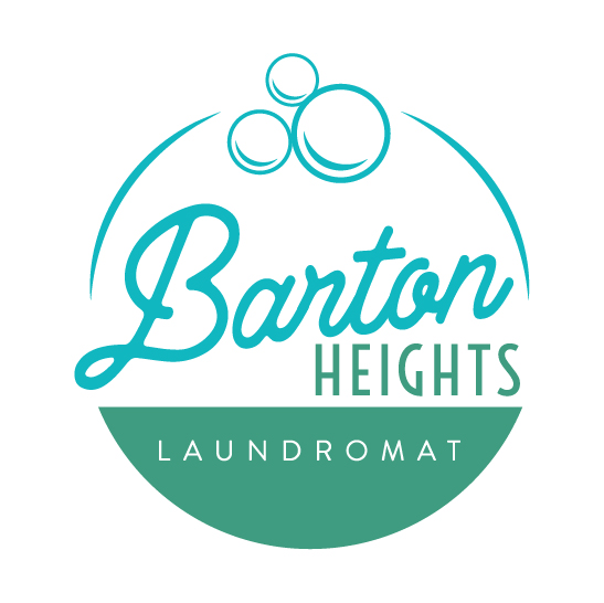 To give a real world “I can say it because I was there” example, let’s talk about our client Barton Heights Laundromat. The neighborhood is historic, but it’s also up and coming, with many new and renovated homes and businesses. With all that in mind, I wanted to pick a palette than said “We’re cool, we’re inviting, and you’re going to feel like you’re in your own personal laundry room.” all while keeping a sense of retro meets modern whimsy. Remember what I said about psychology? It comes into play here. Blue again, is trust. It’s calming, tranquil, and dependable. Green is growth and positivity. By taking those foundations and giving them a little twist of modernity, I chose this teal and turquoise combo. It says Barton Heights Laundromat is fresh, bright – and if I may be so bold – hip.
There is more to your branding than just your font, the graphical elements, or content. Color is crucial in setting up your personality. Who would have thought you could snag a new audience and tell them all about who you are with just some color choices?